£446 billionper year to the UK economy
This site uses cookies for essential analytics. You can accept or reject cookies
This site uses cookies for essential analytics. You can accept or reject cookies
Accessibility often gets treated as something extra to do after your website is complete, or if you have a bit of spare time to accommodate a small group of users.
However, if you treat it like this, it could affect how many people can use your website or digital experience, how easily they can use it, and whether they come back.
When you are making a curry, you do not put the spices in at the end, you mix them in at the start. This way, you will have a rich, flavoursome dish. Similarly, integrating accessibility from the beginning will create a robust, long lasting website that people will want to keep coming back to.
This article might give you an idea of why accessibility for your website should not be an afterthought.
Accessibility is about independence.
One day when I was working at the Royal National Institute of Blind People (RNIB) where many visually impaired people worked, there was a real buzz in the office. I found out that there was a new washing machine on the market that could be controlled with an app.
The washing machine company clearly understood the importance of giving everyone independence, without having to rely on someone else to work the machine for them.
That experience stuck with me because it showed that accessibility is about giving people the freedom to do things for themselves.
The Internet should be the one place we all have a level playing field, where all users have access to the same information. Good website accessibility removes barriers before someone has to ask for help.
This is such an important benefit for making products accessible. The “Purple Pound” is a term that refers to the spending power of disabled people and their communities.
According to Fanatic's accessibility and disability research, the “Purple Pound” is worth £446 billion per year to the UK economy. Globally, it is in the trillions.
There are roughly 16 million disabled people in the UK. That is 20% of the population or 1 in 5 people. Let that sink in for a second.
This is a massive market that so many businesses exclude simply by not designing and building with accessibly in mind.
£446 billionper year to the UK economy
16 milliondisabled people live in the UK
1 in 5people, or 20% of the population
40%of UK households include a disabled person
Disabled consumers face accessibility barriers every day. Whether it is inaccessible forms, poor colour contrast, missing alternative text, or websites that cannot be navigated with a keyboard, these frustrations can quickly drive people away and keep them away.
When those disabled users find a website that gets accessibility right, they tend to stick with it. They often even become vocal advocates, spreading the good word about your business to their community and beyond. That positive experience builds trust, and trust is one of the strongest drivers of customer loyalty.
Set yourself apart from the competition by embedding accessible practices in your website from the very beginning. Here are a few simple steps can make a big difference. I go on to explain them further in the linked articles:
Many people are affected by colour choices on a website. You can use your brand colours in your logo and as accents, but you should also find an accessible version of your colours for your background, text and headings.
Videos and carousels should not start playing automatically and animations should be under 5 seconds and only play once. If it is longer a user needs to be able to pause it quickly using their keyboard. I recommend keeping the controls in the top left hand side of the screen so they are discoverable immediately.
If your headings and text are too close together, then it may be hard to read for dyslexic users. But if the spacing is too much, the text can be overwhelming if you are zoomed in. Use white space thoughtfully and with intention.
Keyboard users, who are often partially sighted or blind, move through your site using the Tab button on their keyboard. You should have a logical tab order that follows an F shape, top to bottom and left to right.
Headings should be meaningful and concise so users can read it and immediately understand the content. A good way to write them is to think of the keywords your customer is scanning for and use these in your headings. Additionally, headings on your webpage are hierarchical: one H1 followed by multiple H2, H3 and further tags.
To make your written content accessible, make the language simple, concise and straightforward. When you do use technical language, try to link out to a location where the user can learn more. Formatting tools such as bullet points and short sentences can be useful to break text up.
This is the biggest accessibility nightmare for users and should be the thing that you put the most effort into designing. A few top tips: give the user the information they need to fill out the form at the very beginning, include labels with your fields, ensure your instructions are clear and make sure it is obvious when the user fills it out correctly and incorrectly.
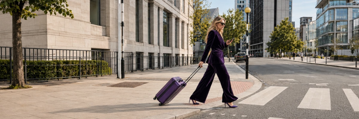
Accessible design is just simply good design. In urban planning, “curb cuts” (the sloped bits of pavements) were designed for wheelchair users, but so many of us use them too, like parents with prams, travelers with suitcases, cyclists and delivery drivers.
Digital design works the same way:
Temporary impairments like a broken arm or an eye infection can also affect how users can access your website. Plus, if someone finds your website when they have a broken arm, they will most likely return when it is better.

We all suffer from situational disabilities such as when you are tired, distracted, or even when you are holding a baby in one arm. AI assistants come in handy here when you need to search for something but cannot type with one hand.
This also applies to the older generation (and do not forget this includes your future self!). Accessible design helps people continue using digital services confidently when their vision, hearing or dexterity changes.
Of course, you cannot include everyone in your accessibility policy, but my recommendation is to imagine how someone with and without a disability and a blind person will navigate your website.
The goal is not to build separate experiences for different groups, but to create solutions that work for everyone. For example, many videos now include subtitles, which are essential for some users, but for me as someone with dyslexia, having them permanently displayed can be distracting. Being able to turn subtitles on or off gives people control over how they consume content.
If you were curious as to how websites appear with different disabilities, you can use my disability simulation tool.
Creating an accessible experience works in orbits. You will not be able to help everyone with a single change, but the things you do to help ripple outwards, adding benefits for a diverse range of users
Blind · Deaf · Autistic · Dyslexic · ADHD · Search Engines
Deaf · Autistic · Dyslexic · ADHD
Blind · Autistic · ADHD
Blind · Dyslexic · ADHD · Search Engines
Blind · Deaf · Dyslexic · Search Engines
Blind · Dyslexic · Search Engines
Blind · Dyslexic · Search Engines
Dyslexic · ADHD
Autistic · ADHD
Autistic · ADHD
Autistic · ADHD
Blind · Low Vision
Blind · Search Engines
Deaf · Search Engines
Deaf
It is astounding how many companies do not bother with accessibility.
A colleague of mine who was a disability advocate was attending an accessibility research and development group. She was telling me about a worldwide budget tech brand who should have been there to discuss how to integrate accessible features into television, but instead they just disrupted the group and slowed their progress. She figured it was so they would not have to spend money on making their products accessible.
Accessibility is the corner companies always cut first, but an organisation that wants to be diverse in their thinking is more likely to create innovative products. This is because they will attract people from a wider range of backgrounds who have different life experiences and perspectives that they can bring to the team. Mark Dean, for example, was a black inventor and physicist who led the development of the colour computer monitor.
A common myth: People with disabilities are more frequently sick and take more time off work. Actually, according to a report conducted by the University of New Hampshire, 86% of employees with disabilities were rated average or above average in attendance compared to their non disabled peers.
Often people with disabilities are harder workers as they have spent their lives being told what they cannot do, so they tend to work harder to prove that they are equal.
They may need reasonable adjustments, but these adjustments, such as allotting time for breaks in meetings helps everyone with their focus. Additionally, meeting software like Teams has transcriptions for people with hearing difficulties, but it also benefits people whose first language is not English.
Many accessibility best practices overlap with good SEO practices, so your website reaches more people while creating a better experience for every visitor. Accessibility is a win-win for both users and search engine rankings!
These are some things that help search engines understand your page's content so they can crawl and index it easier.
Well organised headings help to make your page even easier to scan for both users and search engines.
If your website was an art gallery, you would have a plaque underneath the images describing them. The same applies to your website! If an image is just for decoration, or if you are unsure how to describe it, leave the alt tag empty.
Search engines use link text to understand what the destination page is about, so make sure it is concise and unique.
A logical tab order that follows an F shape, top to bottom and left to right, makes it easier for search engines to scan the website quickly to find the data.
Search engines use information from your pages to build a preview so make sure every page has a relevant, concise Meta description that clearly explains what it is about.
For more guidance on how to improve discoverability, read is your website ready?
A lot of companies assume that having good accessibility is a choice, and the cherry on top of the website cake . However accessibility is not just good practice. In the UK, for many organisations it is a legal obligation.
Under Section 20 of the Equality Act 2010, organisations have a duty to make reasonable adjustments where their practices, environments, or lack of support would place disabled people at a substantial disadvantage.
In 2021, a blind student won a £5000 claim over an inaccessible loan form from the Student Loans Company. This lead to the website's accessibility improvement but only after being sued.
If your website cannot be used with a screen reader, magnification software, or the forms are not accessible, you may be exposing your organisation to legal risk, not just customers who have left your site because of poor usability.
Have an accessibility policy, and be open to feedback. Accessibility improvements after feedback often have unexpected benefits for everyone.
As a dyslexic user, I use a screen reader. At my previous company, I asked the person who created the online training material if they could make it more accessible because it did not work for me. They said it should work for blind users, but after my feedback they tested it properly and it turned out it was in fact not accessible for screen readers. She then added a tool to the page that read all the text out loud.
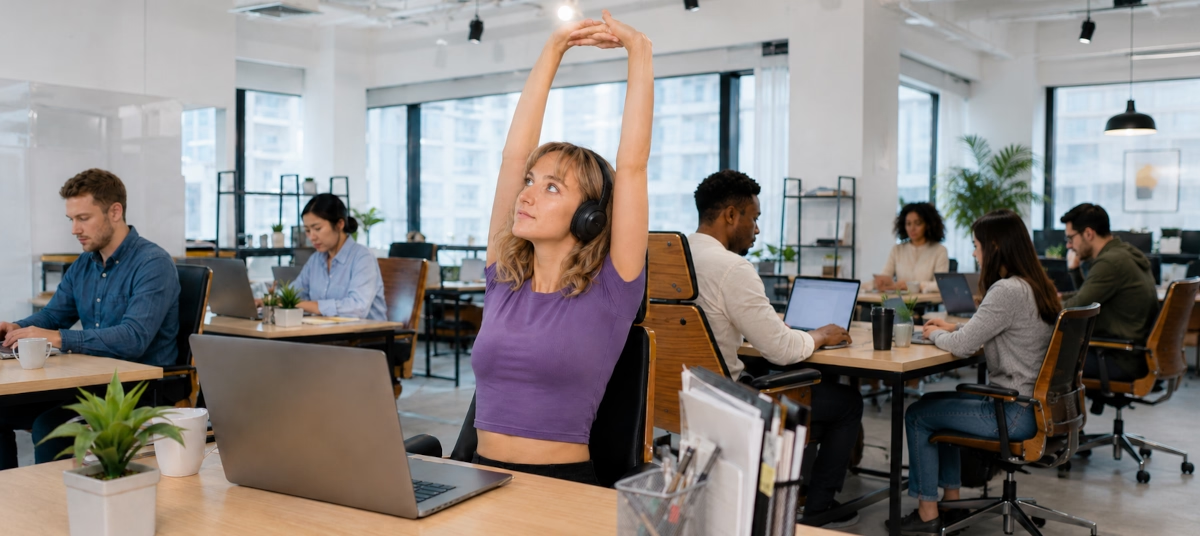
After that, a woman in HR mentioned to me that the screen reader was useful for her because she could now listen to the training while doing other things such as making a coffee or stretching. That is an unexpected benefit for someone who does not have problems reading.
Accessibility is for you, me, everyone, and it is frustrating when people assume accessibility equals boring design, but that is simply not true. The more thought that has been put into the website's design, the clearer and cleaner it looks.
If you were to take one piece of advice from this article, make sure to embed accessibility from the start. This way, everyone benefits. Users gain independence, you reach a larger audience and your content can be better read by search engines.
Always have an accessibility policy and test with different user groups. It does not have to be expensive to do testing, just make sure you have something to give your participants like a voucher or a pizza!
Finally, do not assume that people will complain if they cannot use your website, they will simply just leave.
Accessibility has many hidden benefits like The Purple Pound. Considering accessibility opens your website to a wider demographic and makes it simpler and easier to use for everyone, while maintaining a beautiful design.
If you found this information useful and need help. Book a Free Consultation