This site uses cookies for essential analytics. You can accept or reject cookies
This site uses cookies for essential analytics. You can accept or reject cookies

As a user browsing a website, you are probably just looking around and passively interacting with it. But when you choose to sign up for an account, subscription, or complete a form on a company website, you are giving a level of trust to that company. You are trusting them with your name, email address and other personal details. So when a form fails or is inaccessible, that trust is eroded.
By having accessible forms, you not only make it easier for a wide range of users to interact with your business, but you also maintain the trust that user has given to you.
This article is a deep dive into building accessible forms. It cannot be totally comprehensive, as there is always more I am learning! But if you follow these points you will be able to build forms that are accessible and user-friendly. Remember that user-friendliness will lead to accessibility, so it is in your best interest to make your forms work.
This is an example of a form you might see on a webpage. There are positives and negatives to this form, some of which may not be immediately obvious.
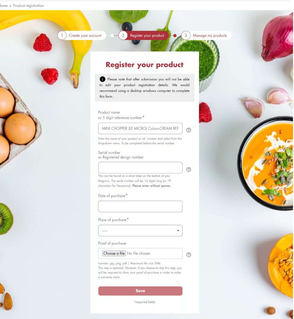

If you do not want to fall into these traps, then read on for guidance on how to create accessible forms.
You should use native controls in a form where possible - the ones that are built in for forms, rather than <div> or any other components. You can enhance these native, default components in your styling, but they should remain the default components underneath. Native components have been tested for accessibility, whereas if you create something that is bespoke or unique, you will need to do this testing yourself, which can be time-consuming and unfortunately may not happen.
HTML5 gives you additional components in forms that allow an enhanced experience. These should be used wherever possible to increase usability. An example of this is the automatic number pad which appears when a user is inputting their telephone number on a mobile phone, rather than the QWERTY keyboard. There are many HTML5 components that will help with your usable, accessible forms - this page from Mozilla gives you a list of the HTML5 input types.
With every input field on your form, there should be a label preceding it: label, field, label, field, all the way through the form. Do not hide the label, do not do weird things to the field or the label - just keep them paired so it is easy to tab through them all.
Do not confuse placeholder text with a label. Placeholder text are the words within a form field that disappear when you click into the field, and are normally a lighter grey. You can give people additional information with placeholder text, but do not use this as a label. The placeholder is often in a lighter colour which is less easy to read, and as soon as someone types into the field, the placeholder will disappear. For users with visual impairments this can be frustrating and confusing.
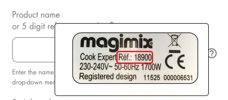
As part of the form field, it should be clear where your user can find the additional information they need to complete the form, if it is not immediately obvious.
For example, if you want a customer to add their order number to a form, you should include guidance about where they can find that order number. I would put this information near the label, so it can be tabbed to easily and is part of the flow of the page. Do not wait for the user to fail to input their information correctly before you explain what they need to do!
Bonus tip: As a developer with more than 25 years of experience, ‘submit’ on buttons has become part of our language. But it is lazy writing - we should really be telling people what exactly the button is doing rather than simply using ‘submit’. Some examples could be:
To enhance a user’s understanding of the form, use legends above groups of radio buttons and checkboxes.
Sometimes you have a form with radio buttons, and above them it describes what they are for - this is called a legend. Use the legend to accurately describe what the groups of buttons or checkboxes are about, and keep related information close together. This will help a user understand what these items are for, making it easier for them to complete the form. This information is also read out loud for anyone using a screen reader, adding important context.
If there are fields that are required in your form, do not assume that people will know an asterisk indicates that it is required.
Instead, put some simple text in the guidance of the form, such as *Required, or ideally add the word ‘Required’ to all of the relevant field labels. You should also use the required attribute in the HTML.
Do not show that a field is required by having a colour-only indicator, such as red text, as this will mean colour blind users may not be able to see it. You need an icon, text, or another indicator as well.
For developers: if you are using HTML5 and put the required attribute on the field, there will be an additional benefit for a sighted user. If the user tabs out of the field and it is empty, or does not meet the requirements of the field, their browser will give them an error message so they can correct it immediately.
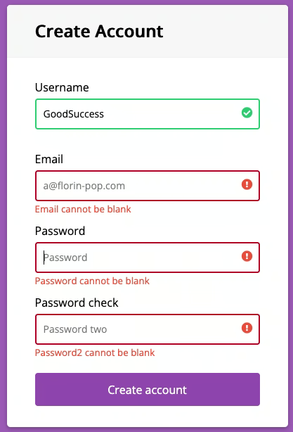
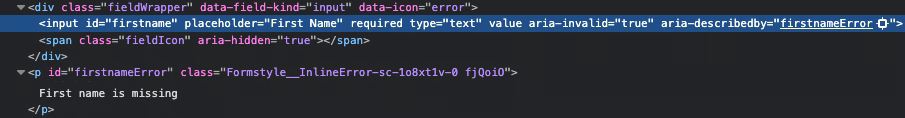
You should always acknowledge if there is an error in the way a user has added information to a form. This should be immediate and the user should receive constant feedback on any fields you can provide feedback on.
This is because it is really frustrating for a user to try and submit their form, then realise right at the end they have missed a field out!
This is the biggest fail on forms - not giving the most appropriate user feedback. You go in, fill out the form, and it does not submit, but you cannot work out where the error is because there is no feedback. The best experience is that instead, when you tab through a form and leave a field - whether you have added information or not - you receive immediate feedback to show whether the field has been filled out correctly Rather than waiting until the very end to find out, your user knows straight away and does not have any surprises.
When explaining errors in a form, make sure to use clear messages with concise language as these will be read out by a screen reader. For sighted users, you can use a colour indicator - such as the field being outlined in red - but do not only use this indicator as colour blind users will not see it. Try using an icon or a change in the border thickness as well.
When your user completes and submits a form successfully, make sure to have a success message so the user knows what has happened. You can have ongoing success indicators on individual fields, but I would do that as a positive reinforcement on required fields, and as an enhancement rather than a necessity.
However, for errors, it is essential to have those ongoing indicators - including actively adding appropriate notifications for blind users. This can only be done through the code.
Any form you create for your website must be entirely navigable using a keyboard only. This means a user can tab through your form, complete fields, and submit the form without ever touching their mouse.
This is essential for accessibility as there are many users who only use a keyboard to navigate the web, including blind users. Without a totally tabbable form, these user groups will not be able to complete the forms on your site - including contacting you or setting up an account.
The tab order for your form should be logical, moving from label to field through the form so that users know what each field is for, and what information to add. There should be a clear focus ring around each element of the form to indicate to a user where they are. Do not remove this focus ring, ever! It is an accessibility essential. You can work with your web designer to style it in line with your brand, but do not remove it.
Make sure to test that your forms work with a keyboard only. It is the simplest accessibility test you can do. Totally tabbable forms are the most user-friendly, not only for disabled users but power users who use their keyboard more than their mouse.
To learn more about testing your site with a keyboard and how to make your site more usable for keyboard navigators, read my article Hands Off The Mouse.
Part of the problem I have in completing forms is the need to gather information from other places, without being told in advance what is needed. Having to go off and get that information means that if the form times out after a few minutes, I will not have time to complete it.
If the security you want on your form means that a user cannot leave the form for too long, you must give them an appropriate amount of time or automatically save the form for them. That way, if it does time out, they can go back in and continue it. Older users and those with cognitive difficulties will take longer to fill out a form and it is important to allow for that.
Ideally, you should also give a user details about what information they will need to complete the form quickly before they begin the form. If your form is long and requires lots of different information, divide it into short sections and allow the form to be saved between them. It is better to have short sections with less information that can be saved periodically, rather than one long form with a high risk of it timing out before the user has filled it in.
Another way to make form completion easier is autocomplete. If a user has an account with a company, then their website will already have at least the name and email address of the user. Once a user has passed a level of security by logging in, any information you have about them should be used to pre-populate the forms on your site.
You can help with this by ensuring consistent naming conventions on your form fields. That way, a browser will recognise the ID hidden behind the form field and be able to populate it for the user. If you use a non-standard ID, the browser will not be able to do this.
You may think that these options are not a good idea for security reasons, but too often we are overriding being helpful to users by being too security conscious. The security is outweighing the ability for the user to have a good experience.

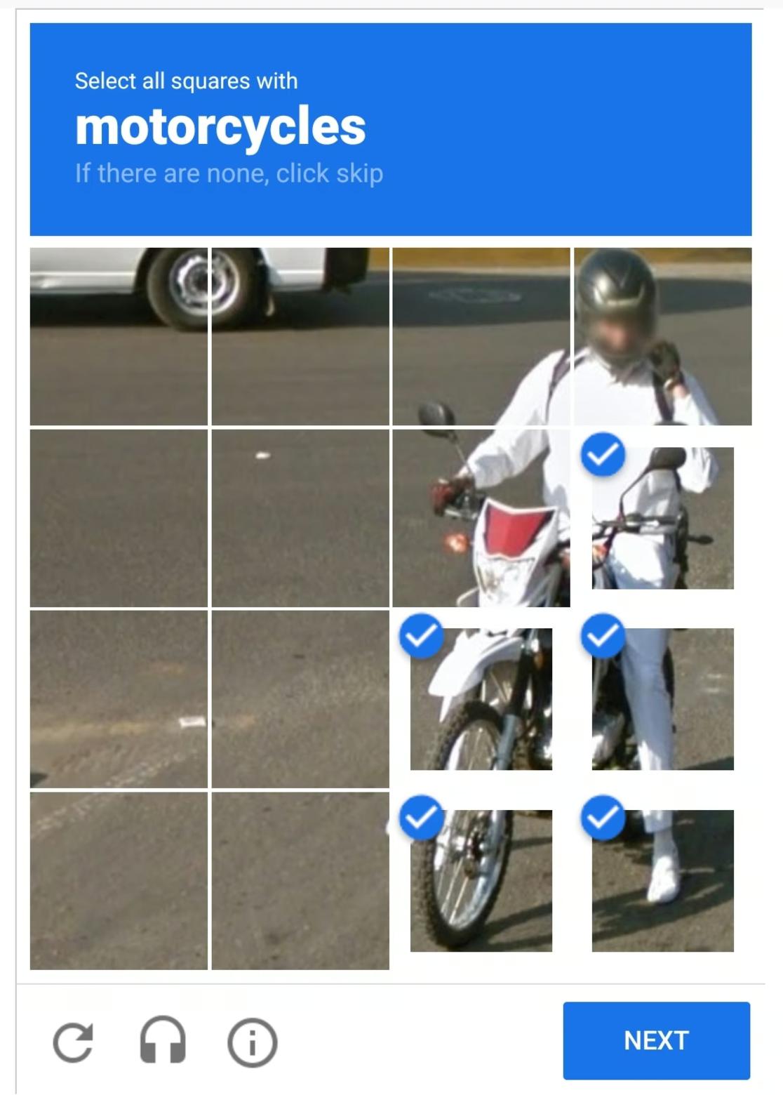
I struggle with CAPTCHAs! I struggle with completing them quickly enough. Sometimes you have to identify something like a pedestrian crossing, but often the images are from America, and their crossing looks different to ours, which can be confusing.
If it is a CAPTCHA where you line up a puzzle piece or image, someone with a mobility issue would not be able to do this confidently. Neurodiverse users might spend unnecessary time trying to get it exactly right because it is not clear how close it needs to be - is it okay if it is a pixel out?
If I struggle and I am a sighted user, then a blind or partially sighted user will also struggle, even with the audio options. The cognitive load and second guessing that these CAPTCHAs require takes more thought than is necessary for filling out a form.
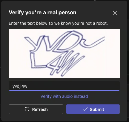
My favourite technique to replace a CAPTCHA is the checkbox of ‘I am not a robot’, but even better would be authentication via email. Or if my browser already knows it is me because I have logged in before, then perhaps there can be authorisation via device.
Before you use a CAPTCHA, think of any other method that will be more accessible. Think about your audience and whether that CAPTCHA is really necessary.
The indicators and enhancements you consider for sighted users should also be considered for blind users. The only difference is that a blind user cannot see these sort of indicators and enhancements - but there are ways to provide them.
With a sighted person you might add a border, icon, and an error message. With a blind person, you can only have an audible error message and this would be done with ARIA tags. ARIA tags give blind users additional context so they understand what is going on, especially when it comes to errors. ARIA tags will alert a blind user about an incorrectly filled in field, and enable error messages to be read by screen readers.
Sighted users can see when something has changed - as long as they are looking at the right part of the screen - but blind users cannot. ARIA tags tell them what has changed and what the error is.
Although you may not consider that a blind person will use your site, they are still a person. They still have families, buy presents, or want to shop. Everyone wants autonomy when using the web and ARIA tags will help enhance the experience for this user group.
Our default behaviour as developers is to show and hide. But in the case of blind users, it is better to insert the error message rather than show or hide it. This gives a blind user an equivalent experience as a sighted user - it is just a little more work on the part of the developer.
If you have multiple forms on your website, then they should be consistent. For example, if you are asking for a user’s title (a bit old-fashioned) then you should use a dropdown and include a range of titles, and this should be the same for every form that you have. This means if a user is filling out multiples of your form they are already aware of the information that is required.
It is also important to keep consistent styling across the elements of your site and the form. For example, having the same colour for all buttons across your site, whether part of a form or not. This is a visual reinforcement for the user of what action to take and that by clicking that button, something will happen.
Bonus tip: making your dropdowns searchable - such as finding a country - makes it quicker for a user to complete your form.
It is essential you test your forms before pushing them live, and you need to test with a variety of users. Testing with blind, partially sighted, neurodiverse and a range of disabled users is key because as much as the rest of us have a good understanding, we do not live that experience. We do not know all the shortcuts, we do not listen to a screen reader at high speed, and we do not use the zoomed in function the way a low vision user would.
Conducting user testing is crucial but many organisations seem to avoid it. It does not have to be expensive or time consuming. Offering a gift voucher or products to users can show them you are taking the process seriously.
The forms on your website are the point at which a passive user might become an interested customer. But if your forms are difficult or frustrating to complete, whether the user is disabled or not, you will miss out on that opportunity. Usable forms are accessible forms, and by following the information in this guide you will be able to build better forms for everyone.
Use the Accessible Form Checklist below to help you the next time you are building a form for your site.
If you found this information useful and need help. Book a Free Consultation