This site uses cookies for essential analytics. You can accept or reject cookies
This site uses cookies for essential analytics. You can accept or reject cookies

Websites can be beautiful and accessible. These things are not mutually exclusive, but they do take a bit more thought. Colour and spacing is a key area of consideration particularly because it is something many people care about when building their site, but do not always think about in the context of accessibility and disabled users. The aim is not to exclude people by accident, and to give other users an enriched experience through the use of colour.
In this article I explain which user groups you need to consider when it comes to colour on your website, and how to build your site so that it is as accessible and beautiful as possible.
For this article I have isolated four user types who are specifically affected by colour or lack of it so you can understand their experience in more detail. Some people who are not described in these groups may have similar experiences – for example, neurodiverse users or those who are older. Lots of people are affected by colour and space choices on a website.
Often, when it comes to accessibility, people are so focused on providing for blind users they exclude everyone else. But you cannot just focus on this group – it has to be a balance, giving the best overall experience for everyone.
While I can never emulate exactly how one of these users would interact with your site, by understanding their needs we can empathise with them more and build sites that work for them.
Around 8% of men and 0.5% of women have some sort of colour blindness, according to Colour Blind Awareness. These users may not be able to tell you they cannot see colour, because they have never experienced being able to see it, or may not even know they are colourblind! And you may not be able to tell who is colourblind or the depth of colour they perceive.
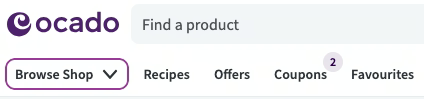
This user group cannot see indicators of colour on your website. Instead they rely on element placement, underlines, icons and spacing to understand what is happening on the site. Imagine it like a traffic light. While many people use the colours red and green to work out when to stop and go, a colour blind person is looking at the placement of the lights and the number of flashes it shows.
When we learn to read, we all learn to read patterns not words. We then retain those patterns to be able to read words we have not seen before. While everybody uses pattern recognition to read, dyslexic users may not be able to use this pattern recognition as effectively if the word is distorted. This could be through colour, image, font choice or other interruptions. This can be on a website or elsewhere.
For example, when I was in college, one of the lecturers used to photocopy everything for me to read – but if the print was missing any bits on a poor quality copy, I could not figure out the word because I read patterns, not words. On the other hand, good use of colour on a site really enriches my experience because it brings additional dimension to content that would otherwise blend into the background.
When you are considering users who are totally blind, you do not have to think about colour or spacing, because they will not see it.
However, it is even more important in this case that you are using the right HTML in the right ways. Headings, links and buttons need to be accurate and meaningful so that a blind user can navigate your website easily using only the words, which they are listening to via a screen reader at high speed. They will not see any navigation that relies on colour or spacing.
A partially sighted user is someone who has significant loss of vision but not total loss of vision. When it comes to websites, partially sighted users often zoom in to the page to increase their ability to see the site.
You can imagine a rectangular magnifying glass about the size of your phone held up horizontally to your screen, moving from left to right. This rectangle will take up the whole screen of the partially sighted user – they will not see anything else, only a small section of your website at a time.
This means that spacing is crucial. Too much space between elements and a partially sighted user may never find them. Centred items mean navigating over a large blank space to reach the content. Anything on the right or bottom right of your site may be totally missed! And anything you have indicated with colour may also be missed because they are not using your site in the way you expect – for example, they may use high contrast on their computer to aid their vision.
As a dyslexic person, colour enriches my experience. But other neurodiverse people might find colour overwhelming, and people who are colour blind just will not notice. You have to have a balance and use colour wisely.
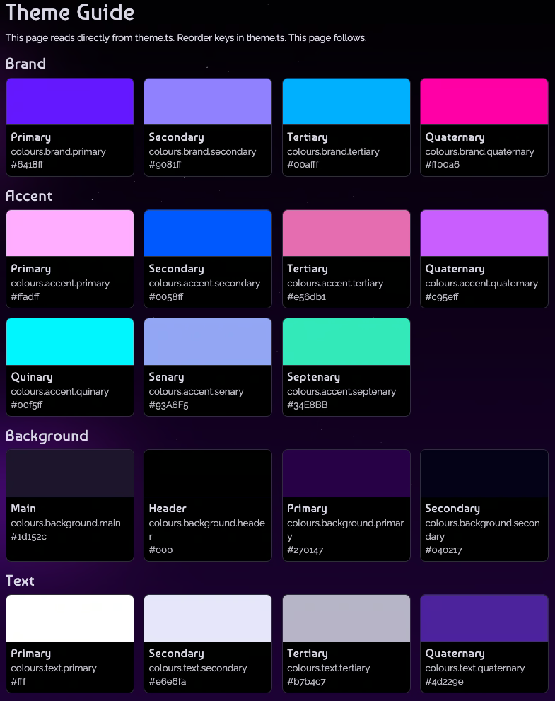
Using colour wisely means having different colours for headings, links and other elements as well as having a colour palette of 3 to 5 brand colours, accent colours and text colours. Be careful to use these appropriately so that users who can see colour recognise what that colour indicates. It also means using colour sparingly to highlight what is important. If everything is colourful, nothing stands out, which is difficult for all sorts of users.
Your colour palette needs to be accessible. You will have your brand colours, but you will also need accessible colours for your background, text colour and headings. These should either be WCAG AAA or AA rated when it comes to the contrast between the foreground and background. Include some colours as accent colours, which you use sparingly.
You should also have 2 to 3 options for accessible button colours as these are key components of your site. For desktop, also consider the colour of hover states of buttons and links.
Remember that your logo does not have to be accessible – but if you are using the colours within your logo on your website, you need a digital version of them which meets accessibility guidelines. This might mean increasing the saturation of the colours so they are more vivid online.
I also recommend you use colours like reds and oranges very sparingly. Although they are colours most easily detected by the eye, they are very hard to read and can feel a bit like all caps in text – like someone is shouting at you! In Western society red also tends to mean an error, danger, or a sale, which you might not want associated with your brand. Even brands who you associate with the colour red, like Coca-Cola and Ferrari, use this colour sparingly and have a colour palette that is monochrome.
The colour palette you consider for disabled users may have an additional benefit to other users in certain circumstances. For example, mobile phone users have the same issues as partially sighted people if they are outside in bright sunlight. In this environment they will be unable to distinguish between different similar colours on your website.
On your site, there are many elements of colour and spacing to consider to ensure it is accessible to all users, including the groups listed above.
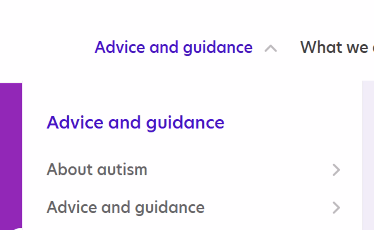
When indicating something on your site, it is important to avoid colour-only information. This means that alongside colour, you must use another indicator to show people what that element is about. This indicator cannot be a hover state.
Instead, some examples are:
If you build your website in a traditional way, there are some things that a user will be able to figure out simply through website conventions, but you should not expect them to do that. Using multiple indicators helps colour blind or partially sighted users understand what parts of your site are about.
For example, links can use colour as an indicator that they are links, but should also include an underline or thicker line. This separates them from regular text, especially in the main content of your website.
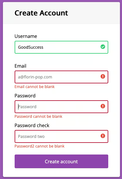
Another example is in a form, where a field has been incorrectly filled. Rather than only using red as an indicator of the error, I use an icon and a thicker, dashed or dotted border. This means there are multiple ways a user can understand something is wrong.
A partially sighted user will be seeing your site in a very different way to a sighted user. They will zoom into the page so a small section takes up the whole screen. This means everything is enlarged, including the space between elements.
A common problem is that people have too much space between elements on their site. Things are so spread out that a zoomed-in user might not discover it. It is not the same as using Control or Command and + to zoom in on your browser. Partially sighted users are seeing a much smaller section and will lose out if there is too much white space.
In countries where we read left to right, we scan websites in the same way, in an F shape pattern. This includes partially sighted people, who may not see elements on the far right of the page because there is so much space between the main content and the element they will assume there is nothing else there.
My particular type of dyslexia means I recognise words as shapes, so if a word is not crisp I may not be able to read what it is. Words on patterned backgrounds or images are extremely hard to read because of this.
Similarly, partially sighted people need to be able to see a significant amount of the lettering to decipher what the word says. If they are zoomed in to text on an image, the edge of the text can lose crispness and become pixelated. It can also be hard to distinguish colours when text is on an image.
One solution to using text on an image background is to use a plain colour, semi-translucent overlay, or gradient in the container which holds the text. This means the text always has a background and is therefore easier to read. You can also add a drop shadow to the text itself to give further definition.


Make sure to keep related items physically close to each other on your website. If elements are too far apart, a zoomed-in and partially sighted user might get lost trying to find it.
One common example is making sure the ‘Submit’ button for a form is an appropriate distance from the form itself. Another is ensuring content and buttons are in the same alignment, rather than content being left aligned and buttons being in the centre. Ideally, keep all your elements left aligned in countries where we read left to right, so users are not hunting for the content.
If your headings and text are too close together on your site, then it is very hard to read for dyslexic users. But if the spacing is more than 3 times the line height, it can become too much spacing if you are zoomed in. You need to use white space thoughtfully and with intention to give all users a good experience.
White space can be used as ‘breathing room’ for neurodiverse users who might find blocks of text or other elements overwhelming. Breaking elements up makes it easier to read and prevents the ‘river effect’ where the white space between words becomes more prominent than the words themselves, which affects dyslexic users.
Your buttons and links on your site should be big enough for people with low vision to be able to see and use. On mobile, always consider fat thumbs and make the buttons or links big enough. Many people use only their thumbs to navigate on mobile, so any clickable item should be a big enough hit point for a large male thumb to click it without accidentally clicking something else.
On a desktop, the standard size for a clickable item is 24 by 24 px. On a mobile, it is 44 by 44 px. One way you can create a larger area to click on is to use meaningful link text, which has an added benefit to blind users.
A focus ring appears around elements on your website when a user is navigating your site with their keyboard, rather than a mouse. It looks like a small box that appears around a particular link, button or other element.
Sighted keyboard users will see the focus ring, but blind keyboard users will not. However, their experience of navigating the website is similar and depends a lot on their ability to navigate with a keyboard.
The focus ring should be high contrast, with enough space around it so it does not overlap other elements, and ideally in a colour which is not used elsewhere on your site. You can leave the focus ring as it is, but if you want to you can consider styling the outline to give an enhanced experience and make it more prominent. Whatever you do, do not remove the focus ring! It is essential for accessibility.
People with dyslexia can often find pure black text on a pure white background too harsh to read, and have problems fixing the text on the screen. Other user groups with light sensitivity or vision issues may find the reverse - white text on pure black - difficult to read.
Other users who are on their screen a lot may prefer dark mode. For example, as a web developer I use my screen a lot and so dark mode is essential as it feels less harsh on my eyes. Years ago when there were no dark themes or options like that, working in a bright office with brilliant white screens would often give me a migraine.
Everyone is different. Light sensitivity is not all the same, and probably it is quite common in neurodiverse users. However, there are some simple fixes.
A common fix for this on your website is to avoid pure white and black, and instead use dark grey or a darker colour for text with an offwhite, cream, salmon or light pastel colour for the background. This is mirrored in books, where you rarely get pure black text on bright white paper and instead have a very dark text on cream pages. This can be a nicer reading experience for some users.
Just because you have a large desktop screen and a full width browser does not mean the whole thing should be taken up with text! If a line of text is too wide, it can be difficult for some users to find the start of the next line or continue the meaning of the sentence from one line to another.
My rule is to have text containers no more than 800 to 900 pixels wide. This makes it comfortable to read for most users and prevents them from having to move their head just to read your site.
Try to avoid using columns like in a newspaper on your website as the text can be too narrow to read comfortably. You can have some information in ‘cards’ that sit in columns if it is compact, with subheadings and images to break it up.
An appropriate size of font means your website content will be readable for a wide range of users. The Web Content Accessibility Guidelines (WCAG) state 18pt regular or 14pt bold should be used, although if you are using a narrow or cursive font that may need to increase so it can be read. I also suggest a line height of between 1 to 1.2 times the font size - be careful not to decrease the line height as text can begin to overlap and becomes harder to read.
You do not need to dramatically increase the font size to try and make your site more accessible - many users have the technology to do this for themselves. If the font is too big, I do not like it because it is almost like you are shouting at me and I do not understand why the text is taking up so much space!
We also tend to use mobile phones in portrait view, but sometimes if a font is too small I will turn my phone to landscape to get a larger view. On mobile a user should be able to pinch and zoom, just like the Control or Command + on desktop, to enlarge their view of the text. Ensure this is always possible.
Oh, and never use all caps. Not only does it seem like you are shouting at me, it is more difficult for dyslexic readers to read words in all caps.
On your website there will be elements that have multiple states depending on how a user is interacting with them. These states need to be accessible to all users.
A focus state is when something on screen is currently selected, such as a button being pressed. The indicators for this state can be colour but should also be another visual element for colour blind users.
A hover state is when your mouse ‘hovers’ over an item. If indicated by a colour change this also needs to meet accessibility guidelines. Hovers are not typically visible on mobile devices so be mindful about using hover to indicate anything.
Finally, disabled states are when something is not working yet such as a submit button on a form that has yet to be completed. For accessibility reasons, use the appropriate disabled attribute on buttons and input fields as this will make the button greyscale - for sighted users - and screen readers will also read that the button is disabled. This will prevent an element being clicked accidentally.
One type of image that specifically uses colour and spacing to convey information is an infographic. If you are using infographics, charts or graphs on your site, then colour should not be the only indicator for the data that is represented. You can use an additional label or a pattern to indicate what the different data is, alongside a key.
Include text information underneath the infographic which explains what it represents. This information will be read by a screen reader for blind people - or other screen reader users - and will be useful for other user groups who may not be able to interpret the information in the infographic.
If you found this information useful and need help. Book a Free Consultation