This site uses cookies for essential analytics. You can accept or reject cookies
This site uses cookies for essential analytics. You can accept or reject cookies

Have you ever seen a blind person use a mouse? They cannot. Instead, they use a braille device or a keyboard to use their computer. This includes navigating the web.
But it is not just blind users who use a keyboard to visit websites. It could also be you if you break your wrist, suffer from repetitive strain injury (RSI) or have a condition like arthritis. Keyboard users who do not use a mouse are everywhere, and if your website is not built to support them, you are missing out. You are shutting the door to people who have money to spend. According to the Return on Disability group, this is a $13 trillion global market with the spending power of disabled people.
In this article I explain who uses a keyboard to navigate the web, what you need on your site to support them, and how to test your site using only a keyboard.
There is also a Keyboard Navigation Cheat Sheet for you to try this yourself.
For your own website, there are some essential components to consider when building a site that is easy to navigate for keyboard users.
Keyboard users move through your site using the Tab button on their keyboard. You should have a logical tab order to the elements on your site, following the way that a sighted user might look at the page in an F shape, top to bottom and left to right.
When you build a site, the tabs will be logically ordered automatically. Normally, if this does not happen, it is because developers have deliberately changed the tab order to try and be helpful, or some part of the code has broken. If you logically build the pages on your site using well-structured headings and links, then do not change anything in the tab order, you will never need to worry about it!
The one exception to this is if you are adding notifications for accessibility purposes, such as error messages or alerting blind users that something has been loaded into the page. In these cases, changing the tab order is acceptable as it is helping the user focus in the right place.
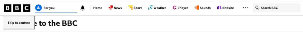
Skip links are essential for people using a keyboard to navigate your website, as well as for blind users. Although they should be standard on all websites, they are not - including big businesses who should know better!
A skip link usually appears as the first link on a page, and allows users to ‘skip’ to the main content of that page. This means keyboard users do not have to tab through extensive navigation menus before they reach what they are looking for. For users with screen readers, it means they do not have to listen to lots of unnecessary content being read to them before they get to the good stuff!

When navigating through a website using the Tab button, a sighted user will see that the element they have selected is surrounded by a focus ring. This is an indicator to show exactly where you are on the page.
Commonly, designers do not like the aesthetics of the focus ring and I have sometimes been asked to remove it - but I would never do that. There is no circumstance where you should remove it. It is an essential indicator for sighted keyboard users. Not all designers understand why the focus ring needs to be there. However, you can work with your web designer to make it look prettier if need be.
Be very clear on what your focus ring looks like compared to other elements on your site. If you are using a colour for your focus ring that appears elsewhere on your site - for example, you use a pink ring and you already have pink buttons - it will be harder for a sighted keyboard user to distinguish whether they are on an element which has been selected or not.

A common problem for keyboard users navigating the web is getting trapped in parts of your website and not being able to get out. This happens frequently with pop ups.
A pop up is something that visually jumps up and overlays on the screen. An example might be a cookies notice or an announcement. Sometimes pop ups are not built in a way that is friendly for keyboard users: the element pops up but you have no way of accessing it via the keyboard, or you can get into it but not get out!
This is the same with carousels. Carousels are groups of images like a slideshow that often automatically move without user interaction. Carousels are rarely tested in the way that is needed for them to be accessible to get into, scroll through, and get out of using only a keyboard.
To make sure this does not happen to keyboard users on your site, remember the following:
Just as a user must be able to get into and out of elements on your site using only their keyboard, they should be able to take the same actions that someone using a mouse can take. These could include clicking a link, selecting a product, reading more information, or adding something to their basket. They should be able to use the Enter or Space keys to do this.
Normally, if this does not work, there is something broken on the site. You would have to do something to actively stop these functions from working - which does sometimes happen.
A keyboard user should also be able to use their Arrow Keys to move within elements on your site, such as a dropdown menu, or to scroll the page itself up and down.
Forms are very common on websites but they are probably one of the biggest usability and accessibility fails on the web. Poorly thought out forms affect all user groups, including expert users who may or may not be sighted or have a disability. They want to be able to fill out and submit forms rapidly and inaccessible forms prevent them from doing that.
Forms on your site should be totally tabbable and submittable without using a mouse. If a user cannot do this, it shows that you have not put thought and consideration into their experience - and it just will not work for a blind user. A user should be able to go from element to element in your form in sequential order with no problems, using the keyboard navigation shortcuts to complete and submit the form. If you cannot submit the form without a mouse - get out of the house!
Using the right <label> tag in the HTML of your form means that screen readers can describe the purpose of an input field immediately. Site builders should do this, but sometimes people want to be clever. They make the labels of the field, such as email address, disappear or change when it is clicked. Labels should always be visible so they can be read by screen readers - and so they are memorable to sighted users.
For example, how often have you started filling out a long form only to be disturbed in the middle of it and need to do something else? When you come back to the form if the label has disappeared you will not remember what to add in! Similarly older or forgetful users might forget what the field was. So to avoid cognitive overload, keep the labels visible at all times.
Another area where websites do not meet the needs of keyboard users is in how video, images, moving text and carousels function on the page.
Web Content Accessibility Guidelines (WCAG) make it clear that any video that auto plays or carousels which automatically scroll should be able to be turned off with a keyboard. In fact, I recommend that no video, animation or carousel should even start without the consent of your user!
Carousels are one of the biggest problems and lots of websites use them. Automatic carousels cannot easily be navigated with arrow keys and it becomes very easy to get trapped in a carousel when you are using the Tab button on a keyboard to navigate the page. Ticker tapes are also an area where keyboard users can easily get trapped. These are elements showing scrolling or animated text, often along the top of a web page. When tabbing through to navigate the site, a keyboard user may find themselves stuck in the ticker tape element as every time they press tab, the tape moves - so they never get anywhere.
Your user should never feel they are just a passenger on your website, waiting for things to change. Both carousels and ticker tapes should be avoided for accessibility issues, but it is an interesting conundrum: personally I do not think you should use them, but if you are going to use them be aware that it is very easy for a user to get stuck!
Because they are almost impossible to make accessible, allow people to skip them through a tab-activated skip link or controls which are independent of the movement of the element and can be accessed immediately. And use ticker tapes at your peril.
WCAG indicate that any animation on your site should be under 5 seconds and only plays once, and if it is longer a user needs to be able to pause it quickly using their keyboard. With video and carousels, allow the user to be in control of whether it plays or not - all through their keyboard.
The best way to understand using a keyboard rather than a mouse to navigate the web is with practical examples. The videos below show how the Amazon website can be navigated using a keyboard. You will see examples of tab order, skip links and what it is like to navigate a carousel. You can also hear an example of how screen reader software decribes the Amazon website for any user such as a blind person.
If you are a developer, or if you are working with a developer, here are some useful things to think about when building your site in a way that supports keyboard users.
First, do not mess about with the tab order of the page. If you have structured the page well the tab order will be useful to people navigating with a keyboard. Ask your developers not to change the tab order unless it is completely necessary, and if they do, then they need to make sure they consider the accessibility impact for keyboard users.
Always use the appropriate HTML tags on your site. Form fields including radio buttons and checkboxes all need to have labels. It is where using semantic HTML is most important. Do not just use a <div> component and make it clickable as it will not be fully accessible.
Only build and use custom components where necessary. If you can just use normal controls, such as radio buttons, use them. Any custom components need to be fully accessible to keyboard users. An example of an accessible custom component from my site is the colour picker on the Purple Paradigm colour contrast checker.
Finally, test the site with a keyboard each time. Testing with a keyboard only is the simplest accessibility test you can do as you do not need any other software - you only need to turn off your mouse. Remember when testing that you should be able to navigate to all parts of the site by tabbing, even simple things like links.
It is very important to test your site for keyboard users and it is one of the simplest accessibility tests you can run.
Click into the address bar in your browser and press the Tab button. You may interact with the buttons of your browser first, but eventually you will land on your site.
The first thing you should interact with and tab to on your site should be the skip link. This will be a button or link that says ‘Skip to main content’ or something similar. If your site does not have one of these, you need one!
From there, try to interact with your website using the keyboard navigation buttons such as Tab, Shift + Tab, and Enter. Make a note of what works and what does not.
If you found this information useful and need help. Book a Free Consultation