
Accessible Content Writing: A Complete Guide for Web Editors
No site is accessible without accessible content. Even if you make every effort to enhance your website with great design, images and navigation, it will only ever be as accessible as the content itself.
This article is a guide to help you improve the accessibility of the content on your site. It is specifically for anyone who is putting together the content for their own website, content writers, and content editors.
Why Accessible Web Content Matters for SEO and Screen Readers
We tend to think of websites visually before we think about the content. Sighted users focus heavily on what a website looks like, the colours, images and layout, to understand what it is about. But there are certain user groups who cannot do this. Considering their experience can guide you to write more accessible content.
Blind users cannot see anything you put on your website. All your brand colours, fancy fonts and pretty images do not mean anything to them. Instead, they navigate your website using screen reader software which describes the content of your site to them out loud.
The holy trinity of accessible content for blind users is link text, headings, and button text. Blind users will listen to their screen reader at high speed as it describes these three elements, and quickly choose where they want to go on your site based on what they hear. They will also navigate using landmarks, although these are more structural than written content and must be proactively added using well-written HTML.
But it is not just blind users who do this. Search engines also read your site in this way, paying close attention to the headings and links to understand what it is about. This means if you write your content with accessibility in mind, you will also gain benefits from search engines like Google.
How To Write Accessible Link Text
Bad Link Text
- Click here
- Read more
- Learn more
- Download
- Check it out
- Link
- Show more
- Open/Close
- Show/Hide
- Previous/Next
Good Link Text
- View our 2026 Annual Report
- Read more about our sustainability goals
- Learn more about our pricing plans
- Download the User Manual (PDF, 2MB)
- Browse our Summer 2026 Collection
- Visit the official BBC website
- Show more about keyboard accessibility
- Show/Hide more about colour blindness
- Previous: Personal details
- Next: Career history
Link text always needs to be meaningful and concise. Ideally, it should also be unique so you avoid lots of links across your site that say 'click here' or 'read more'. These are not helpful to a blind user or a search engine.
If you are linking to the same section, page or product from different places on your site, it is okay to use the same link text each time. It can even be a good idea as you are subtly reinforcing the name of the resource, product or service each time you use it. The text acts as a reminder of what is being looked at or linked to, which is helpful not only for screen reader users but people with cognitive disabilities, or even someone who has just got distracted and forgotten what they are doing on your site.
You can add enhancements for blind users and hide them for sighted users if you really need to have a link that looks like it only says 'click here' or 'read more'. But if you can instead make the whole link meaningful, concise and unique it will be more beneficial.
Link text appears in lots of different places across your website, and it is easy to miss. For example, anywhere you may have 'next' or 'previous' should be a link or a button, and needs to be written to be concise and unique just as with a regular link.
This approach will aid you in writing link text that makes sense out of context so that a blind user navigating your site via link text, headings, and button text, and not reading the paragraphs you have spent hours writing, will be able to find what they need.

How To Write Accessible Headings for Websites
When writing for their website, people often like to use catchy or snappy headings that sound like a click-bait newspaper headline. These headings are written to get your attention but do not always tell you what the actual information on the website is about. Whether you are a sighted user, a blind user, or a search engine, they are really unhelpful.
This is because users are looking at headings when they quickly scan a site, working out whether the information they need is on that page. Screen reader users are listening to headings, trying to do the same thing. Once a user finds the heading they are interested in, they will read that section deeply. Headings which do not communicate what is in that section or on that page make life harder for your user.
Just like link text, headings should be meaningful and concise. It is not bad to use lots of headings because it can make the page easier to skim. A good way to write accessible headings is to think of the keywords your customer is scanning for and use these in your headings.
For example, someone browsing a cooking website will be looking for particular cuisines, ingredients, methods and recipe reviews, so your headings should reflect what they are looking for. It is about thinking of the basic elements that people want to know about the item or service you provide, and making sure your headings align with these.
Heading Hierarchy Best Practices (H1, H2, H3, H4, H5, H6 Explained)
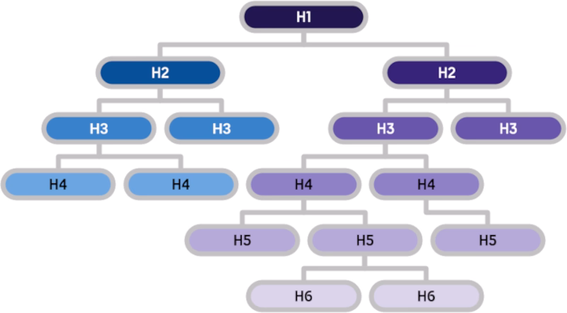
Headings on your webpage are hierarchical. There is one H1 followed by multiple H2, H3 and further tags. Think about the different layers of your content to help you write these headings so they are accessible. For example, on the website for a bar, there might be a page about the cocktails they offer. The headings might then be:
To make your page even easier to scan for both users and search engines, your headings can aim to answer a question that your user might have. The information below that heading can then answer that question.
For example, for the Manhattan cocktail above, a question your audience might have is "What are the ingredients in a Manhattan?" Therefore one of your H2 or H3 tags might be "Ingredients in a Manhattan".
Useful Tips For Writing Accessible Content
How To Use Paragraphs Effectively for Web Content
Paragraphs help to make your long-form content scannable and easier to read, but it is important to get the balance right. Paragraphs which are too long can feel academic and cause eye fatigue. They are also not going to be read by dyslexics like me, or anyone else who might have memory problems or a short attention span. On the other hand, too many short sentences, each on a different line, can be difficult to read as the meaning of the overall writing can get lost.
Remember that your website is not a novel. It is acceptable for a page in a book to be full of text, but not when you are reading on screen. Using paragraphs to break up the text, based on the headings and subheadings you have determined, will help make your content more accessible and easier to read.
Plain Language Writing Tips for Web Accessibility
To make your written content accessible, make the language simple, concise and straightforward. This will be less exhausting for the user and get them to where you want them to focus without too much effort on their part. They can also then focus on the information they are trying to access rather than complex language.
Think about who your audience is and try to reduce technical jargon until it is necessary. When you do use it, try to link out to a location where the user can learn more about this technical language. Even users who understand your topic might be encountering an idea for the first time, and so it is important to explain things clearly. If you are writing for a user who already understands your topic, then some jargon makes sense, but otherwise be careful not to exclude people. It is not about dumbing down but about making it simple until it needs to be technical.
The context of your website and business is also important. Think about what your user is looking for or interested in, and therefore what style of language is going to be most useful. For example, if you are writing a blog post that goes into depth on a specific topic, you might find technical jargon is useful to communicate the information. However, if you are writing something that is about helping the user complete an action, such as the content on a banking website, then the language should be as clear and simple as possible.
Further Tips For Simple Language
- Consider writing for deaf users who do not have English as their first language. They need more simplified English which may then also work for dyslexic users as well as other readers with disabilities or where English is not their first language.
- Explain acronyms first because they can mean different things in different contexts.
- Contractions, such as can't, may be difficult to read for some dyslexic people so consider avoiding those.
- Avoid using sentences which are too long, with multiple 'ands' or a long line length, as it can be hard for some users to understand and read these.
Use Formatting To Help With Comprehension
One of the benefits of content on your website is that you can use formatting tools to help your user understand what your content is about and make it more accessible.
Bullet points are snackable and easy to understand, but it is important to keep them short, rather than just sentences with a dot at the beginning. Using <bold> tag type and the <strong> tag is good but should be used sparingly. I personally do not use it often but it can be very useful to break text up.
On the other hand, italics should be used very sparingly. They are almost like gold dust, and ideally do not use them at all because they can be very hard to read. Italic text can make some letters look very different, narrow the font face, and cause distortion which is difficult for dyslexic people like me to read. If you are using italics to add emphasis, use the <em> tag rather than the <i> tag as it will be read out appropriately by screen readers. For sighted users, you could add emphasis through colour or a different font weight.
Something to absolutely avoid is text in all caps. It feels like you are shouting, even if you use small caps. If you must use them, they can be reserved for short headings. For anyone with cognitive disabilities, especially users with dyslexia, it is going to be extremely hard to decipher the word in all caps because all the letters are the same height. The normal shape of the word is therefore harder to recognise. And although we are used to handwriting, curly, cursive or handwriting-style fonts are very hard to read. Use them sparingly, if you must use them at all.


Think of it like this. If you want someone to read your website content and access what they need quickly, you do not want them to feel tired trying to decipher what it says because of the font choice. You want them to be able to comfortably read the text, which means making formatting choices to help them do that.
How To Write Alt Text for Images
I have noticed that most images used on most websites are decorative. In this case, you do not need alt text for your image. But if your image communicates more than what is included in the text, you should think about how to write effective alt text to bring all the content to life.
Good alt text for screen reader users is a bit like listening to an audio book. It enhances their experience of your content, just like seeing the image enhances the experience for a sighted user. You can write your alt text by thinking about how you might describe the image to an audience member if you were on an audio-only podcast.
For more help on getting your alt text right, read When To Use Alternative Text.
How Do Screen Readers Read Emojis? And How To Write Around It
Emojis are a popular addition to online writing, but they can be very inaccessible. That is because they are treated like images by screen readers, which read them out in full wherever they are in a sentence or on a page.
This means that if you use them in a sentence, you should think about using them to replace specific words that are mirrored in the name of the emoji.
What you write: We 💗 this new purple lipstick launched in time for Valentine’s Day!
What the screen reader says: We growing heart this new purple lipstick launched in time for Valentine’s Day!
This sentence does not make sense for a blind user or someone using a screen reader. However, you can still use an emoji but in a different way.
What you write: We love this new purple 💄 launched in time for Valentine’s Day!
What the screen reader says: We love this new purple lipstick launched in time for Valentine’s Day!
This version works better for a screen reader and can still be understood by a sighted user. However, the best way to continue using emojis is to hide them from screen readers, but this will be very difficult for you to do without web developer help.
Therefore I recommend to avoid emojis where possible, keep them for informal communication like social media posts and only in relevant context. It is also important not to use ambiguous emojis. Instead use emojis that most people understand or can relate to, such as the ones based on facial expressions. If you want your content to be accessible whether it is to a disabled user or someone like your grandma, it is important to use emojis people understand.
You can also choose to use more inclusive emojis that will put a smile on the face of your audience. This might be choosing a range of different skin tones, or one of the emojis representing disabled people using a cane or wheelchair.
For more insight into the accessibility of emojis, read my article: Emojis & Accessibility.
Should You Use AI To Write Website Content? Tips for Content Editors
It might be tempting to use an AI tool to write your website content for you, especially if you are very busy. But something to remember about AI is that it is a tool. It cannot replace you as a human being because you have expertise and knowledge the AI does not have.
Therefore your first port of call should not be getting an AI tool to write your content for you, but trying to write it yourself and then using the AI to copycheck, edit or proof your work. After that, you will still need to review what you write.

As someone who is severely dyslexic, I use AI to help me with my writing. However, I always review it thoroughly before publishing. One way I do this is by asking the AI to read what it has written back to me. If you do this, close your eyes, listen and pay attention, you might find you notice errors or edits more easily than if you were to read what has been written. Remember you do not have to be dyslexic to use tools that I benefit from.
I have noticed that you cannot rely on an AI tool to write accessible or even accurate content. Sometimes it hallucinates and makes things up. I like to say AI is just as menopausal, ADHD, and forgetful as I am. AI tools have also been trained to be helpful. This sometimes means that it looks at what it thinks you want and creates that, or makes it up, rather than directly responding to your prompts. It can also be very verbose and adds too many words, which can create inaccessible content. And it can be prejudiced, because it has been trained on data sets which have those prejudices. This is why it is essential to have your own personal rules, ideas and input. It is meant to be your writing enhanced by AI rather than AI enhanced by you.
Here are a few suggestions for using AI effectively to create accessible content:
- Keep prompts short and work on small sections of content at a time to avoid AI continuity problems.
- Maintain a back and forth relationship with the tool. Just like Microsoft Word, it will give you suggestions to review and you do not have to take those suggestions as gospel.
- Make sure to do your research and collect your ideas together before you start using AI to help write your content, as I suggest in the Guide To Creating Your Small Business Website.
Extra Resources
- The Plain English Campaign website has useful courses and guidance on writing in clear English.
- I use Grammarly to help me check my emails and other business communication.
- I have also used Language Tool to check grammar and paraphrase my writing.
- Screen reader tools are built into most devices and will read writing back to you. Check out my resource page Text to Speech Software to find out what is available.
- You can quickly check the readability of any content using the Web FX Readability Tool.