This site uses cookies for essential analytics. You can accept or reject cookies
This site uses cookies for essential analytics. You can accept or reject cookies

Launching a website can feel a bit like hosting a dinner party. You think everything is in order, but just as your guests arrive, you realise that one chair is wobbly, the starter is still in the freezer, and the bathroom door does not lock!
Websites are the same, except instead of guests politely ignoring the issues, visitors just leave.
If you are running a small business, your website does not need to be perfect, but it does need to work. This is an extensive guide to help you test your website more effectively. If you are just starting out and looking to build your website from scratch, read Guide To Creating Your Small Business Website.
Before you test your site using any of the tips I share in this article, it is essential you are clear on the purpose of your website.
Think of it like Formula One. You can have a beautifully engineered car, a top driver and a flawless pit crew, but if no one is clear on the race strategy, things unravel fast. A clear goal is your race strategy.

You should know who your website is for, why your website exists and where you want to direct your customer. Make sure you are clear what the point of your website is by writing a simple statement.
Once you have this statement, test that every part of your website is helping achieve it. For example, if you were browsing the Vogue website, you should always be able to see the latest fashion news simply and easily.
Your website does not have to contain every possible page, but whatever is live should feel complete, clear and intentional. This is called your Minimum Viable Product.
If you are working to a deadline, for example if you are going to a conference, do not bother trying to build the entire website at once. Start with a simple one page site which includes your logo, a clear explanation of what you do, who you are and how to contact you.
Think of it like baking a tiered wedding cake. You would not decorate it before it is baked! Some parts can wait, but the basics need to be in place before you go live.

Bonus Tip:Continuity and familiarity breeds trust, so maintain your tone of voice and the style e.g. the colour scheme, buttons, fonts, headings.
The next thing to check is that all the content is there, complete and well organised.
Are there any spelling or grammar errors? If you need help with this, copy and paste your website content into an AI tool and give it the prompt of :
"Do not rewrite, but just proofread in British English and give me a list of typos and grammatical errors."
Alternatively, if you can, get a professional copywriter to do it for you, or someone who is good at proofreading.
Make sure all the pages that you want are there and completed and there is no placeholder text such as lorem ipsum. Also, ensure you do not have an under construction or coming soon page or section.
There are many things in life that accessibility has improved and the web is one of them. Anything you do to improve your accessibility on your website improves the usability and also helps search engines find your site. Making these things more accessible will help keep people on your page!
The text should be well spaced. This includes the spaces in between lines, headings and body text. To aid readability make sure the text is not too close to the edge of the screen, especially for mobiles.
Web Content Accessibility Guidelines (WCAG) recommends that text should be a minimum of 24pt/32px (bold 18pt/24px) for headings, and 18pt/24px (bold 14pt/18.5px) for body text. For more guidance on text spacing visit WCAG.
Bonus Tip:Why not try standing a couple of steps away from your screen to see if it is still readable?
Check that your colour scheme is accessible by using Purple Paradigm's Colour Contrast Checker.
When you have a form, make sure it is clear when it is incorrectly filled out and use two things to indicate an error. As some users cannot differentiate between colours, use something like an icon as well as a colour.
Have you correctly labelled your buttons and links? Avoid click here or read more. Instead use read pricing guide. This is descriptive text that makes sense out of context. Both Understanding and organising your page headings – A Digital and The W3C Markup Validation Service will help you with basic page structure. To learn more, read my article on accessible writing.
Ensure your headings are readable, make sense, not clickbait and help the user understand the information. The recommendation is there should be only one H1 per page followed by H2, H3, H4 etc. Using the heading tags will help search optimisation and blind users to skim your website. 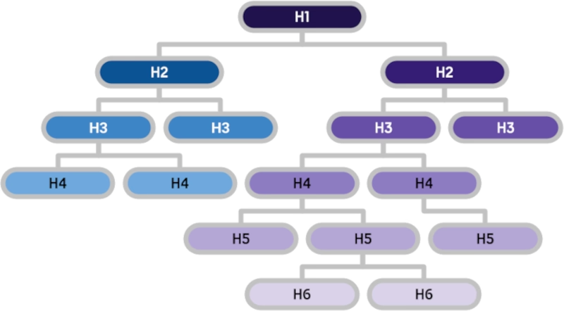
A carousel/slider is a sequence of content cards that can include video, text or image, navigated using arrows. Although they are good at condensing content, carousels can be overwhelming and distracting for some users, especially if they are animated. They are hard to navigate with a keyboard so they are not accessible. Try instead having a main (hero) image, then a series of mini cards with text underneath. Read this case study for a deeper dive into carousels.
Although animations look beautiful when you first see them, for some users they can be distracting. According to the WCAG animations should be kept to a minimum, should not be continuous and should only last for a few seconds. For the same reasons, videos and carousels should not autoplay and should be able to be paused.
Ensure your website includes a skip link, which allows keyboard users (including those who are blind and visually impaired) to skip the navigation and go straight to the page's content.
To test your skip link, once the page loads, press Tab and the skip link should appear at the top of the page. It really is as easy as that!
Emojis are fun and a great way of expressing yourself without words. However, they can interrupt the reading flow and can be annoying to screen reader users. Therefore, try to keep them to a minimum, especially the animated ones. For more guidance on using emojis and how to hide them read Are Emojis Accessible.
How many times do you go to a site and you see something simple that lets it down? A link that goes nowhere, text that is hard to read, or fonts that make you work too hard to understand what is being said.
These are not complicated problems, but they have a big impact. They quietly chip away at trust and make it harder for users to take the next step. The good news? Most of these issues are quick, easy fixes.
Check that the links work, they all make sense, have meaningful text and go somewhere. Make sure any contact details you have are clickable. If you have an address ensure it is in html 5 address tag:
<address>97 Saint Christopher's place, Oxford Street, W1A 1AB</address><a href="tel:+442035551234">+44 203 555 1234</a>If you have forms on your website, it is vital to test that they work.
Read Forms For Everyone for a more comprehensive guide.
You should only have pop-ups if you are preventing someone from proceeding e.g. needing an age verification to enter your site. Be aware that they can be distracting and can interfere with the user's flow. Consider carefully where they are placed, either in the footer, header or part of a registration, or just avoid them altogether!
Bonus Tip:Use a banner at the top of your page instead of a pop-up to give the user the opportunity to accept the cookies or not.
Plugins give your site additional functionality without writing code and can be something as simple as language dropdown lists, chats or an accessibility tool. If these are not up to date or paid for they can break an aspect of the page.
Check the Inspect Console to make sure there are no red bits. To do this, right-click on the empty space anywhere in your web page, and it will say inspect. You can skip this if you are less technical, but it is a good way of ensuring nothing is broken.
JavaScript is used to create the interactive elements like sliders or menus that can stop working due to console errors. You can check this in the same way.
Your domain should work both with and without the www at the beginning, plus most websites now no longer use this prefix (sub domain).
Check that your URL starts with https:// to verify that the SSL certificate is valid. This is represented by a small padlock icon which appears next to your website URL in the browser address bar. If you have antivirus software it may also give you a badge so check that as well.
For a more detailed explanation of SSL Certificates, have a read of Cloudflare's What is SSL?.
If you are out and about, what do you use? Your laptop? No! Your tiny computer in your pocket. Therefore it is vital that your website works on all different devices.
According to mobile traffic statistics from Exploding Topics, over 96% of internet users access the internet using a mobile phone. As you can see, this is the most important medium.
To ensure your site works on a range of different devices, why not have a 'Test My Website' social? Invite your friends and family round, provide snacks and a checklist of what you want them to look at on their phones. Make sure they are people who are going to be objective and observe how they use your site first hand.

Do the fat finger test and get them to click all the links and buttons to check that they are far enough apart to be clicked by all different finger sizes!
Remember to pinch and zoom and rotate the screen to see how the layout changes.
Look at your website on a larger screen like a monitor. The Responsively App is free to download and shows your site on multiple screen sizes simultaneously.
Bonus Tip:Stand back a couple of paces and see if you can still read the headings.
Check that there are no cross-browser glitches, which is a site that looks perfect in Chrome but breaks in Edge, Safari or Firefox. All desktop browsers have a developer mode which you can access by right-clicking anywhere on the page, then selecting the inspect button.
Use responsive mode, which is part of the developer tool kit, to give you an idea of how your site will look on different screen sizes.
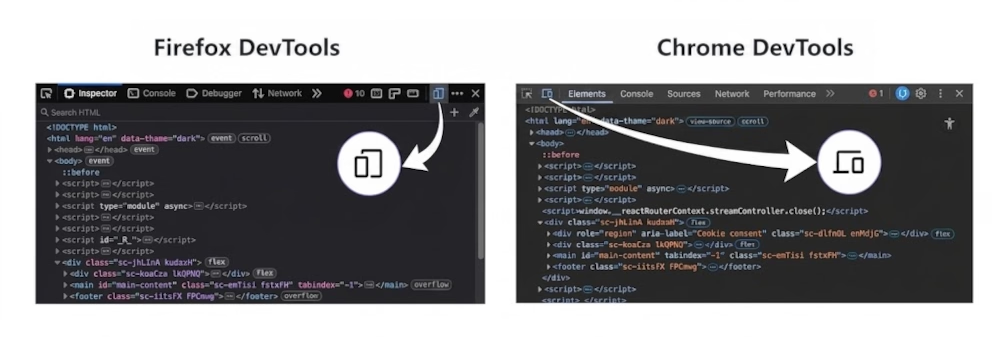
If you do find a bug on your browser, it is always best to confirm an issue on real devices whenever possible. Mobiles render fonts and spacing differently from a desktop browser. Even between two browsers, things can look slightly different on the same device.
You can download BrowserStack which allows you to see your site in different browsers and devices without owning them. But nothing beats testing on real devices!
There is no point in having an amazing website if no one can find it.
Metadata is basic search engine optimisation (SEO) housekeeping to help search engines understand what each page is about and plays a key role in how your site appears in search results.
Check these on every page so you can be seen by the people you actually want to reach.
Make sure every page has its own unique heading (H1). This helps search engines like Google understand and rank your page, and it improves accessibility for users navigating your site.
The H1 should accurately describe the page's content. If the title is vague or misleading, people will not find you, or worse, they will leave straight away because it is not what they expected (clickbait).
Your main menu should have no more than 7 items on it and try to make the labels under 2 words. It should be concise and easy to scan.
Try to avoid hover menus as they do not work on mobile devices and can be difficult for some users to navigate.
Bonus Tip:Avoid Mega Menus. Although stylish and beautiful, they do not work well on mobile, they are frustrating (as you have to use it precisely) and can be problematic when using assistive technology.
To The Web's Test page title & meta description is perfect for experimenting with different titles, but you do need to manually update it in your website.
Make sure every page has a relevant, concise description that clearly explains what it is about. Google may use this as the snippet shown in search results.
When someone searches for your website, Google pulls information from your pages to build that preview. A well written meta description gives you a better chance of standing out and getting that click!
When you post a link to your website on social media platforms like Facebook, X, Instagram and LinkedIn, a preview will appear with an image, title and description. This is formed using Open Graph (OG) Metadata.
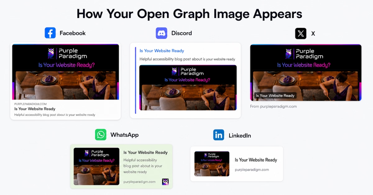
OG previews is a great website to preview your page's link as it shows you what it looks like across different social media platforms. Try the OG Image Maker to create effective OG images, or read this helpful blog post to find out more.
Do not worry if this seems too technical! Even seasoned developers may not know much about this.
A Favicon is a tiny icon used to represent your website, almost like a bookmark.
These are the size requirements you must follow when creating your Favicon (sizes in pixels) :
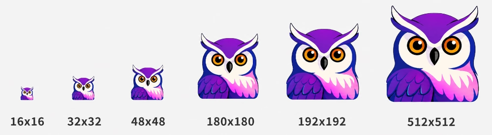
If this feels a bit overwhelming, Favicon Generator (favicon.io) will do it all for you. It is a great tool that has everything you need to create, convert and check your Favicon.
Bonus Tip:Use a transparent background as it works against all colours.
Your canonical URL is the single voice, telling all the search engines which page represents the others. You might have lots of stormtroopers, but there is only one Darth Vader speaking.
Choose the 'main' page you want search engines and users to be directed to, especially if you have similar pages or multiple URLs leading to the same content.
link rel="canonical" href="https://purpleparadigm.com/blog/articles/2026/may/is-your-website-ready"A slow page does not just frustrate users, it stops them from staying on your site, in fact 53% of users will leave your page if it does not load within 3 seconds. This is called the Bounce Rate.
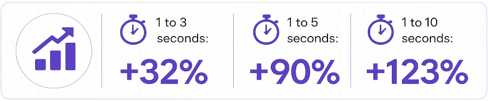
Testing your website's speed helps you create a smoother, more reliable experience and will keep users on your page.
Test your page on Edge, 3G, 4G and WiFi to see how fast it loads. To do this, in your Inspect Console, there is a tab called Network. Click No Throttling and there should be a dropdown to select No Throttle. This will give you the Network Speed options.
This will also help you test your alt text. Someone might be looking at your page when they are on a bad network and if the images do not load, the alt text comes up. If it is written descriptively, people will be able to understand the images on your site without having to look at them. For more information on When To Use Alternative Text, have a read of this article.
Tools like Google PageSpeed Insights and Pingdom Website Speed Test are great at giving you a guide on how your site is performing. It does not have to be perfect, but you want to aim for a good, stable working site. As and Bs and over 80s, not Cs and Ds and under 70s!
Slow load times are often caused by images that are too large or not properly optimised.
Compress large images before uploading them, especially for mobile devices. Remember to keep enough quality to avoid visible graininess (try between 70% and 90%) and not to exceed 1200 pixels in width if possible.
Consider file formats such as AVIF or WebP for faster loading times. Tools like GIMP and Canva can help with resizing and exporting images.
For Open Graph thumbnails, PNG and JPEG formats are recommended. Tinify Image optimisation tool is great for compressing and converting AVIF, PNG, JPEG, and WebP images.
Bonus Tip:Always go for the image with the smallest size but highest quality.
Do not use more than three fonts on your website as they may make the page slower to load. Google Fonts are good as they are used prolifically on the internet, so they will already be downloaded in your browser.
Be mindful about using lots of website plugins and JavaScript animations or interactive elements as they can negatively affect page speed.
I know, legal checks are not the exciting bit. Nobody launches a website dreaming about privacy notices, cookie banners and terms of business. Sadly, they still matter.
Check whether you need:
My recommendation is to always get some kind of legal advice if you are unsure.
Bonus Tip:Different rules can apply to personal and business use, so double check that you have everything covered.
A successful website is not about perfection, it is about clarity, usability, and making it easy for people to do what they came to do.
Let us think about your business as if you are opening a high street shop. It does not need to be fancy on day one, but your business name should be on the sign, the door should open properly and nothing should block people from getting inside.
Even having over 25 years of experience in website building, it is not possible to know everything! Just from writing this article, I learnt more about Open Graph Metadata which led to me optimising my site even after its launch in 2025.
Start with the basics, keep it clear, and improve as you go.
If you found this information useful and need help. Book a Free Consultation