This site uses cookies for essential analytics. You can accept or reject cookies
This site uses cookies for essential analytics. You can accept or reject cookies

A common issue I get with accessibility audits is when and when not to use alternative text. This article gives you specific scenarios of when to use alternative text and the best ways to use it so that you can tackle this topic with confidence.
Alternative text, often called alt text, is a written description of an image. Its purpose is to ensure the image’s meaning, essence and purpose is conveyed when it is not viewable.
We need alternative text, especially for blind users, because if there is additional information conveyed by the images on a page, that information should be conveyed to all users equally.
Sometimes images fail to load, especially on a slow internet connection. For sighted users some browsers may fail to load an image. In these cases the alt text will show up for sighted users and will be a substitution for the image, so you want the alt text to convey meaning.
Other times, people use screen readers. These are common for blind users, neurodivergent users, or anyone who prefers listening instead of reading. Each of these user groups will use a screen reader in different ways but every screen reader is software that reads text out loud. This text can be on a web page or other document.
The two most popular screen readers for blind users are NVDA (free) and Jaws. These are comprehensive tools that aid blind users in navigating everything on their screen, including websites. These powerful screen readers read every piece of text available with no discrimination, including alt text, text that is otherwise hidden to sighted users, and contextual information.
Well written alternative text turns words into an experience, much like an audiobook.
It allows those people who are unable to see the image to experience its impact, emotion, and story as vividly as if they were viewing it themselves.
Alt text means that if there is an absence of an image, or the user cannot see the image, the purpose and meaning of the image is portrayed equally.
As I am severely dyslexic, I very rarely read and use a screen reader all the time. The screen readers I use tend to work by highlighting a specific area of text, or the whole page, and I choose what is read to me. This differs substantially to the way blind users use screen readers.
Every device or operating system has some option of a 'point and shoot' screen reader, but not many people know about it. By using a screen reader all the time, I have encountered many of the issues outlined in this article.
If your image contains text, you must write alt text for this image. For example, if you had a graphic of Maya Angelou’s poem “Still I rise” on your website but did not share it anywhere else on the page, your alt text for this image would need to include the text of the poem, because this is the information the image is meant to convey.
Some images carry the whole story. Others set the tone and add emotion. They make your content stand out.
If the image explains your message better than words alone, it deserves alt text. Alt text is your narration, your chance to say, "This image matters".
If no one would miss it, leave it blank. If the image changes how someone experiences your content, describe it.
Imagine your website is visually rich: an artist’s gallery, a designer’s portfolio, a photography showcase. In those cases, alt text is essential.
Think of your website as the Vatican. The images are Michelangelo’s frescoes. Alt text is the tour guide standing beside each one, explaining to visitors additional context.
When done well, alt text brings your website to life for screen reader users and helps search engines find your content.
An additional benefit of alt text on visually rich websites is that using it to name image files can improve search engine optimisation and make your images more discoverable.
Google is the most popular search engine in the world. It is not human. It is a computer. It cannot see or hear. Like most assistive technology, it relies on text.
Google is looking at the text of your website to understand what it is about. This includes text such as image filenames and alt text. Alt text is the most important factor, followed by the filename, and finally the surrounding text to understand the context of the image. If your words are trapped inside an image, they are invisible to Google.
What works for assistive technology like screen readers also benefits search. Accessible websites are easier to navigate, more understandable, and more likely to appear in search results.
If the meaning of the page is clear without the image, leave out the alt text. This gives screen reader users a smoother experience because otherwise they are hearing the same information multiple times, without receiving any additional content. It can feel like an interruption without any extra value. If the meaning of the page is dependent on the image, alt text is necessary.
If the image repeats something already explained in the surrounding text or caption, leave the alt text empty.
If the image shows the same object from multiple angles with almost identical descriptions, describe one and leave the alt text for the others empty.
If banners, background images, patterns or design elements are just artistic flourishes with no functional purpose, leave the alt text empty.
Not always. Sometimes less is more.
The best alt text might be no alt text at all.
If the image does not add anything new or simply repeats what is already on the page, leave it blank.
If you have decided you do not need alt text for your image, you should include the alt text attribute in the image tag but leave it empty.
If you include the alt text attribute in the image tag, but do not put any alt text in so it is just an empty attribute, the screen reader will know to skip this. This provides a smoother experience for screen reader users.
An empty alt text attribute should look like this:
alt=""If the alt text attribute is missing or absent, a screen reader will still notice an image there, and read the image filename instead. This can be frustrating for users and your filename could be nonsensical so it is an interruption that does not add value.
Imagine browsing a new phone on a retailer’s website. There is a lovely image gallery.
You see the front, then the back, then the side. Maybe even look at the top if you are feeling fancy.
However, a blind screen reader user will not see these images. Instead, their screen reader will describe to them whatever alt text has been written for these images.
Top view.
Side view. Power, volume buttons.
Back view. Fifty million different cameras.
Bottom view. Type C USB charging port.
Side view.
Let us be honest. Most mobile phones look the same.
A screen. A volume button. A camera. Maybe four or five, if you are lucky.
So to someone using a screen reader, the alt text description is just unnecessary noise when all the real info is on the page: the specifications, the colours, the battery life. Everything you need is there and therefore it will be read by the screen reader.
If you want to enhance accessibility, consider adding skip links for any image galleries.
You wake up. You realise it is a bad hay fever day. You cannot face looking at anything online, so you turn on the screen reader.
You are reading an article about your favourite F1 driver. Lewis Hamilton has just pulled off an outrageous overtake. Two cars. One corner.
The article describes it in vibrant, beautiful detail. You are right there with him.
Then comes the image.
The screen reader kicks in.
It reads the alt text which describes the same moment.
Then there is a caption underneath.
It says the same thing.
Then, just to be absolutely sure you did not miss it, the paragraph after the image continues in the same excited tone.
One overtake.
Three tellings.
No new information.
Just repetition.
This is a bad example of alt text because it is repeating information and interrupts your flow when you are listening. This is frustrating for users.
This is a prime example of how even major organisations can get accessibility wrong. The article talks about Ricciardo. The image has a helpful description clearly written just below it:
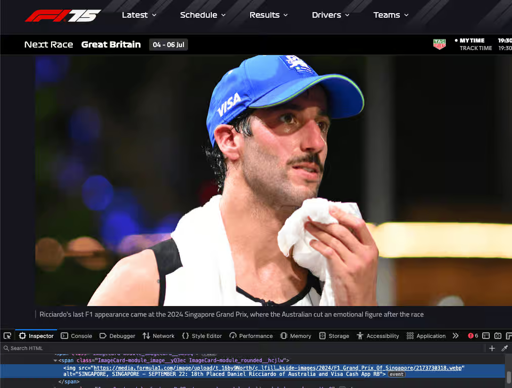
'Ricciardo's last F1 appearance came at the 2024 Singapore Grand Prix, where the Australian cut an emotional figure after the race.
Then comes the alt text:
“SINGAPORE, SINGAPORE SEPTEMBER 22: 18th Placed Ricciardo of Australia and Visa Cash App RB”
The description already tells us what is happening. The alt text adds nothing. It is just someone shouting random branding through a megaphone.
This is what happens when accessibility is rushed or misunderstood. Leave the alt text empty if the content is already described nearby.
This screenshot is from the Formula 1 website article with the title Ricciardo enjoying life in the slow lane...Used under fair use for commentary and critique. Copyright belongs to Formula One World Championship Limited.
As a small business owner, here are some examples where you might need to use alt text.
If you have described the product in detail on the product page, it is probably not necessary to add alt text unless the image conveys something which you have not described.
This one is a judgement call. If the contact page is all about you, then you may not need alt text describing your photographs, because there is enough information there already. However, you may wish to include alt text if you think that a user will receive additional value from imagining the content of the image.
If there is text in your image, you should write alt text for that image. The exception is if everything in the image is described in the main text of your post.
For example, if you are sharing an image of a motivational quote, you should write alt text for that image if you have not duplicated the text of the motivational quote in your main post.
If you are using a purely decorative image on social media, you can leave alt text out.
If the image contributes to the meaning of the post, and you have not described it anywhere else in the main text of the post, you should write alt text.
There is one additional case. On LinkedIn, you can post image carousels using PDFs. In order to make these accessible, each image in the PDF needs alt text so that when a blind user moves through the PDF, they get the same experience as everyone else. Generally, PDFs are an accessibility minefield so do your research!
When you are writing blog articles or news updates and using images as a decorative element, you do not need to include alt text. The exceptions are where there is text in the image, such as in an infographic, or the image conveys meaning which is not described fully in the article.
When a screen reader encounters an emoji, it says the name of that emoji.
For example, if you use emojis instead of bullet points in a list, a screen reader will read out that emoji before the content in the list.
Thomas Edison
Inventor with over 1,000 patents
1847 to 1931
A screen reader will read this information as:
Lightbulb Thomas Edison
Lightbulb inventor with over 1,000 patents
Lightbulb 1847 to 1931
This very quickly gets annoying!
Although it can be tempting to use emojis as decoration, they are read out loud by screen readers without discrimination wherever the screen reader encounters them. If you want to make your content screen reader friendly, keep your use of emojis to a minimum. With some additional work you can exclude the reading of emojis on your site, but not on social media.
Imagine you are talking to a friend on the phone. You have just seen something brilliant, but you have no data left. You cannot send them a picture. No video. No camera. You just have words. That is all.
Now describe it.
Start there, trust your eyes
Whatever it is, write it down.
Say what you see
Begin with the obvious
Describe what pulls focus
Describe the features that jump out or define the tone.
With these questions in mind, use a few of them to help you write your alternative text. You do not need to answer all of them. Just pick the bits that will concisely help someone imagine the image if they cannot see it.
If you cannot articulate what your image is conveying, or you find it difficult, then leave the alt text attribute empty. If you feel your image is conveying essential information that is not anywhere else on that page, you can use AI to help you write the necessary alt text.
As a dyslexic person, I find it hard to accurately use the appropriate words for alt text. When I use AI to help me, I can generate the right alt text using the right words. AI is not a starting point but can be a tool to help you.
You already know what the image shows. You just need a way to get started. Try using this prompt with AI:
Can you help me write some concise alt text for screen readers?
Can you give me a few different alt text options for this image, each capturing a different tone?
The image shows [your image description].
No need for perfect grammar or polished language. Just write down what stands out. If you are unsure what to include, revisit the writing alt text section above. Mood. Colour. Subject. Setting.
The AI will shape it into something useful, and ChatGPT, Google Gemini, Claude.ai and DeepSeek all handle this prompt well. They each have free versions you can use.
Be aware that using AI should not be your first step for writing alt text, or any content on your website. Your website content should be written by you and enhanced by AI, not the other way round.
Do not overthink it. It is quite simple. Adding phrases like image of, picture of, or photo of is unnecessary. Screen readers already announce that it is an image. Saying it again is like starting every phone call with “this is a phone call.”
Now, here is where the fun begins.
Stuck with the free version of ChatGPT, it took me three days to fine-tune the perfect AI-generated Siberian cat. In this case, the image is the point of the article. If it was not, I would have left the alt text empty.

alt="Image of a cat"alt="Image of fluffy cat with lolly"alt="Siberian feline with icy lolly near flowers"alt="Photo of Siberian cat outside"alt="Fluffy boi"These either repeat what screen readers already say, give no real description, or just state the obvious. They do not tell a story.
Given the time it took to generate the image, I got a bit creative with the alt text. The first example is mine.
alt="A Siberian cat with tortoiseshell taupe fur and piercing blue eyes sits in full sunlight, licking a salmon shaped ice lolly, with colourful flowers and green grass in the background."alt="A fluffy Siberian cat enjoys a fish shaped lolly in a garden, sitting in the sunshine with flowers and grass behind."alt="A long haired cat with blue eyes licks a frozen fish shaped lolly in a summer garden."These examples give detail, mood, and story. They bring the image to life for someone who cannot see it.
Yes, we are saying it again (on purpose)!
If the image is decorative, already explained, or cannot be described meaningfully, leave the alt text empty.
If your image contains text, your alt text should include this exact information. The exception is if the text is already described sufficiently elsewhere.
Your description should enhance the experience and add value.
It boosts accessibility and helps your images appear in search results.
Avoid unnecessary detail. Focus on what is important about the image.
Do not repeat information in your alt text that is already available in the surrounding content.
We are done. Now go make the internet less annoying and more accessible for everyone.
Want to make your content more accessible?
Book a Free Consultation today and let us make the web more inclusive, one image at a time.