Through Others’ Eyes: Introducing The Purple Paradigm Disability Simulator
As a digital accessibility professional, there are lots of resources I have seen which give people an idea of what it is like to use the web when you have a disability. But I wanted to pull a single resource together that emulated multiple disabilities in one place. I created the Purple Paradigm Disability Simulator to do that.
What Is The Purple Paradigm Disability Simulator?
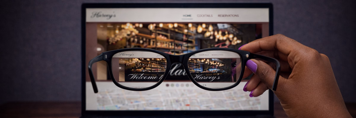
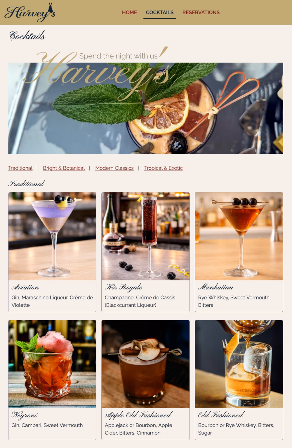
The Purple Paradigm Disability Simulator is an interactive tool featuring disability modes that can be toggled on and off to change the user experience of a fictional micro-site, Harvey’s Cocktail Bar. It works best when used on a desktop browser.
The aim with the Disability Simulator is to give you an idea of how different people might perceive websites as a disabled user. It is a representation of how I think these users might perceive and interact with a website, based on my professional and personal experience. I welcome anybody’s feedback on the simulator, as it is interesting to know how people would like to represent their disability.
There are multiple disabilities that I have included in the simulator:
- Blind and partially sighted
- Cognitive disabilities including dyslexia and sensory overload
- Different forms of colour blindness
I wanted to create something that gave a sense of what navigating the web is like for users with these disabilities, as I have often found myself trying to explain these experiences to others and struggling to do so.
What Disabilities Are Represented In The Simulator?
Partially Sighted Users
One disability I have often tried to explain is how partially sighted people use websites. In previous jobs, senior developers and designers told me that the best way to test if your site was accessible for partially sighted users was to play with increasing the font size and seeing what breaks. The suggestion was that partially sighted users bump up the font on their browser to be able to see the site clearly, but actually they do not do that, because that just gives you the mobile version of the site. Whenever I saw partially sighted people navigating the web, including when I worked at RNIB, they used it very differently.
Partially sighted users tend to have a very large screen that magnifies everything on a web page, not only specific elements like fonts. Some users with low vision, like my parents, might make the font a bit bigger, which can lead to distorted layouts, but this is not the same experience as my partially sighted colleagues. They use specific magnification software that increases the size of everything on their computer, zooming into a specific section of a website, and sometimes having their face really close to the screen to be able to look at what is there. Having an adequate representation of this experience in the Purple Paradigm Disability Simulator was important to me.
Screen Reader Users
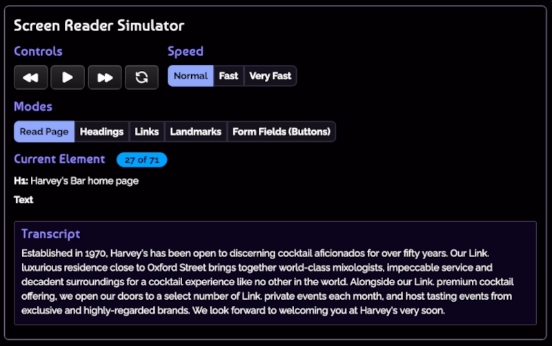
Similarly, the screen reader mode on the simulator is one of the most powerful ones, giving a suggestion of what the web is like for a blind user. It is one of the simplest modes to look at, because it is completely blacked out and you can only listen.
This mode forces you into experiencing the web in a similar way to a blind person, listening to a simulation of screen reader software describe what is on the page. It is not exactly like the experience of a blind user, because they tend to listen to a screen reader at very high speed, scanning the site using headings, links and buttons the same way a sighted user would scan it by looking at the headings, pictures and links. But being forced into only listening, rather than looking and listening, gives you a good approximation of how someone who is blind and uses a screen reader interacts with websites.
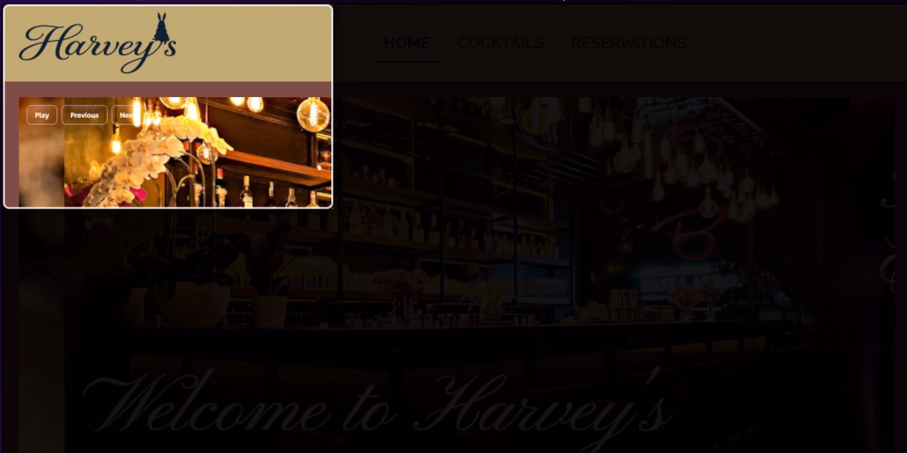
For example, watch this video to hear how the NVDA screen reader can get ‘stuck’ when the carousel auto plays. The screen reader is trying to catch up with the changing images, so even as a user navigates through the rest of the page, they are being interrupted by descriptions of the carousel.
Colour Blind Users
For me, the most impactful modes on the simulator are those which demonstrate different forms of colour blindness. Talking to someone who was colour blind was so interesting for me. I could not quite imagine what it was like, or what they would be seeing, and I could not vocalise it to someone else. The simulator is therefore a helpful tool, giving a demonstration of what users might see depending on their type of colour blindness, and how it can completely change the appearance of a website.
Dyslexia And Neurodiverse Users
There are also some modes that emulate how I see the world to give people an idea of what it is like to look through my eyes. One is Drifting Letters, which is how people tend to think of dyslexia, seeing the words and letters on a screen jump about. However, this mode also shows something I experience which is similar letters occasionally swapping places, and difficulty following a particular line of text as it appears to be moving.
The Decoding Deficit mode showcases my experience of dyslexia where I read by recognising word shapes, rather than specific words, due to phonetic processing issues. I also used my own personal experience to inform the Sensory Overload mode, which took a lot of thought and research into how neurodiverse people might be affected by colour, animation and images on a website. It is a lot harder to show the diversity of sensory overload, but this mode gives you an idea.
How I Built The Disability Simulator
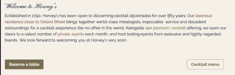
When I began building the Purple Paradigm Disability Simulator , I used AI to help with some starting points that would simply and easily demonstrate the different effects. It generated standard things, like different coloured buttons and links, but I wanted to do more of a deep dive, something I could point clients to so they would understand the experience of a disabled user in more detail. So I thought that a micro-site would be good, and created one for Harvey’s Cocktail Bar.
Websites for bars can be simple with not much written information, plenty of colourful images and the opportunity for links and forms. As a cocktail bar, it also needed to look stylish. This was a good opportunity to demonstrate how you can make something look pretty to a user without any disabilities, but the way someone else might perceive it, such as a disabled user or even an older user, is very different. Plus, I chose a bar not only for the elements on the site but because people who visit a bar like this could be anyone: your 70-year-old grandma, a blind person, someone who is dyslexic. They all like to go out for a cocktail.
Why The Bar Is Called Harvey’s
The cocktail bar is named Harvey’s after the James Stewart film, Harvey. Stewart’s best friend in the film is a 6ft invisible rabbit, a ‘pooka’ called Harvey, who exists because Stewart is thought to be unwell. No one can see Harvey even though he positively influences the people in Stewart’s life.
Harvey is a metaphor for disability. Lots of disabilities are invisible and influence the day to day life of a person. But you do not need to try and fix them because they are not broken, just like Stewart’s character, whose natural kindness, generosity and sweetness is enhanced by the presence of Harvey.

What Web Accessibility Elements Are Featured In The Simulator?
For the design of the micro-site in the simulator, I exaggerated some bad elements of web design, but also added in some positive accessibility components. It was very interesting to think about how to design a site badly and inaccessibly after so long evangelising about accessible web design.
Really importantly, anything that I chose to put on the Harvey’s website was not made up out of my imagination. All the worst components are things I have actually seen on other websites and therefore wanted to replicate to show just how difficult these elements can be for disabled users.
Here are some of these components which you may not immediately recognise as inaccessible, but become an obvious problem when you toggle the different disability modes. Can you spot all of these in the simulator?
- All caps menu. The words look so different compared to when they are in sentence case which makes them hard to recognise.
- Image carousel with readable and unreadable text that autoplays and speeds up in certain modes, making me feel like a rabbit in the headlights.
- Curly, on-brand font that is pretty and just about readable on the carousel but very hard to look at on the cocktail names.
- Link text and buttons that are hard to read due to colour contrast.
- A map that looks helpful but is actually rubbish and does not link anywhere.
- Social media links specifically in the bottom right of the footer so they are hard to discover for zoomed-in users.
- Brand colours which may appear legible and may pass some WCAG levels, but still feel hard to read.
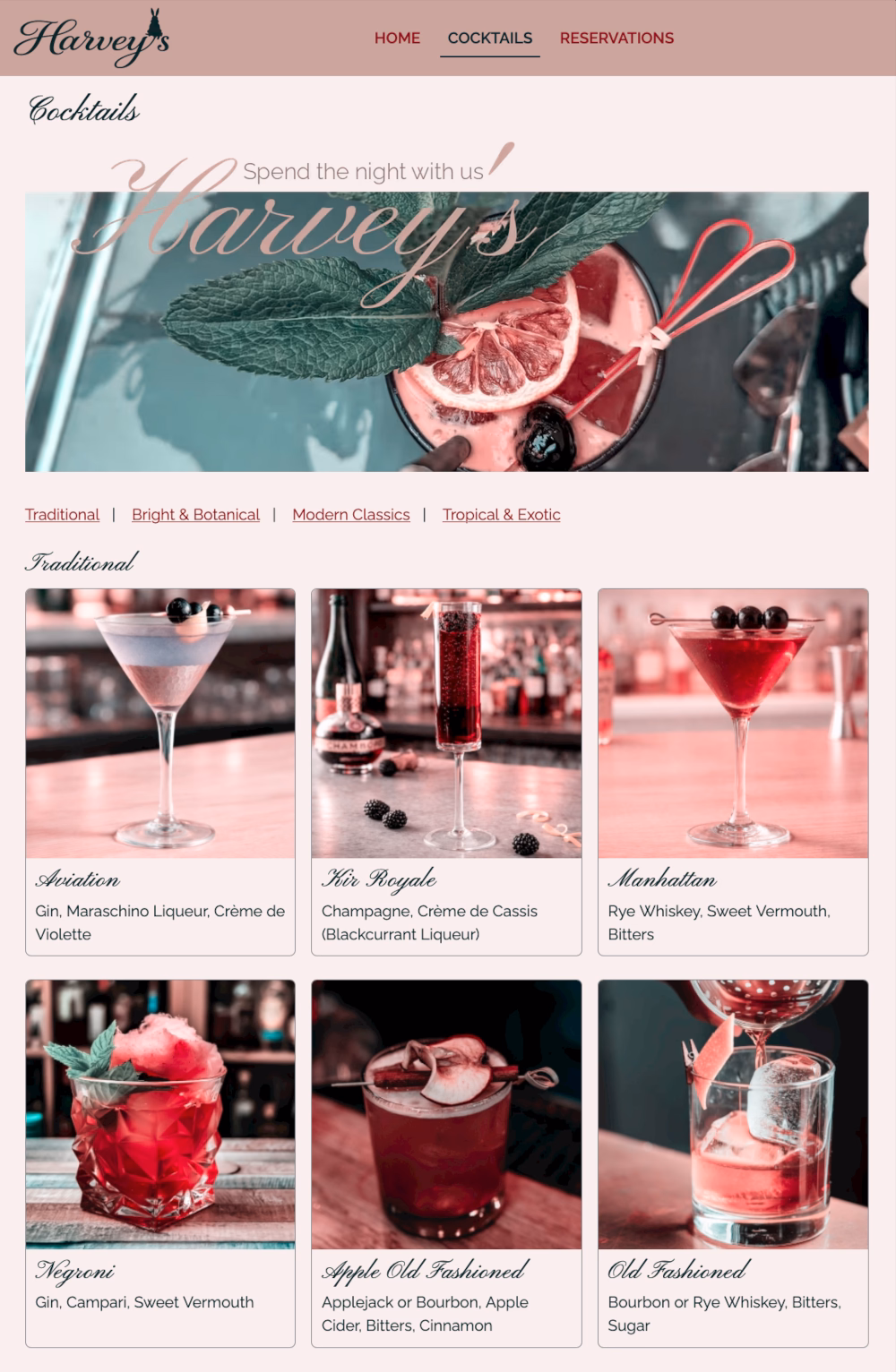
- The cocktails page with beautiful images presented clearly, and that look totally different to a colour blind user.
- A hero image without readable text which, for me as a dyslexic, just feels like looking at a pattern.
- A hero video whose movement and editing may make neurodiverse people feel seasick.
- Components which change between left alignment and centred, a common pattern which is confusing for people using a magnifier.
- A form with poorly considered usability including colour only indicators, no placeholder text, and a ‘submit’ button.
What Is Next For The Simulator?
My aim is to add to the simulator as I go along, making sure it reflects the experience of disabled users as accurately as possible. My intention with all my work is to normalise the disabled experience, and a key way of doing that is through empathy: being able to see the world through the eyes of another person and understand what digital life is like for them. My hope is that the Purple ParadigmDisability Simulator will help you do that.
How To Use The Purple Paradigm Disability Simulator
The Purple Paradigm Disability Simulator features a series of modes which can be toggled on and off to change the appearance and experience of a micro-site, Harvey’s Cocktail Bar. It works best when used on a desktop browser.
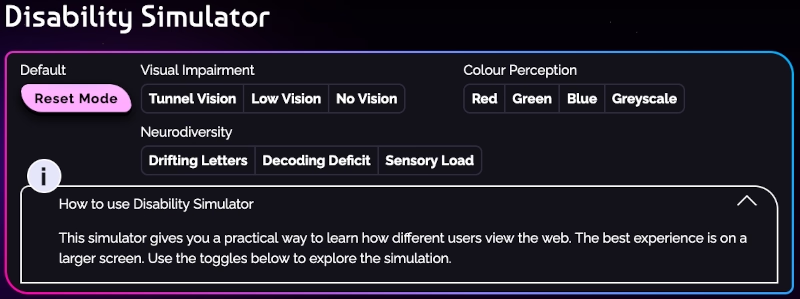
The micro-site is fully interactive so you can do things like switch between pages, click on links and try to complete forms, all while in a particular mode.
Click on any of the disability mode buttons to toggle that mode on. You can also learn more about that disability and the effect it might have on how a user perceives the web by expanding the information box.
To reset the simulator, click the coloured button on the left hand side labelled ‘Reset Mode’ and the default view will be applied.